El Palacio de Hierro
A digital evolution for Palacio de Hierro, blending modern Ui with the sophistication of a legacy luxury brand. The goal: enhance the shopping experience while staying true to its premium identity.

Role:
Senior Visual Designer
Contribution:
Wireframes, Ui/Ux Design, Design Systems
Duration:
2 years
Redesigning a high traffic e-commerce platform for a luxury department store meant simplifying a complex checkout process without losing the brand’s elegance. The challenge was to reduce friction, clarify steps, and improve mobile usability while staying true to Palacio de Hierro’s premium identity.
Challenge

My role
As a Senior Visual Designer, I focused on enhancing the checkout experience across desktop and mobile, aiming for a more intuitive and seamless flow. I also contributed to the creation of a shared design system that helped align teams and streamline interface development across the platform.


Design Principles
Locally rooted, globally inspired
Local culture, architecture, and landscape inspire every detail bringing a sense of identity and pride to the experience.
Craft meets modernity
Artisan textures and premium materials come together to create a warm, refined atmosphere that feels both familiar and new.
Inclusive, without compromise
Accessibility, representation, and flexibility are prioritized to support a wide range of users, without compromising on personality or boldness.
Designed to invite discovery
Curved paths, visual anchors, and layered layouts encourage exploration and create an immersive flow throughout the journey.
A premium digital experience that blends innovation with cultural identity designed
to feel intuitive, inspiring, and unique.
Checkout
The checkout experience was carefully refined to minimize drop off and simplify the purchase process. Every step was designed to be clear, fast, and user friendly, ensuring customers can complete their orders smoothly. This focus on ease and efficiency helped increase conversions across all platforms.

A Streamlined Checkout Experience for Every Shopper
For Palacio de Hierro’s e-commerce, the focus was on redesigning the checkout flow for both mobile and desktop to make purchasing feel smooth and effortless. The design balances elegance and clarity to match the brand’s premium identity while adapting to different user needs.

By improving visual hierarchy, simplifying steps, and adopting a mobile first approach, the new checkout experience reduced friction and boosted purchase completions by 35%. The result is a seamless, refined path to purchase that enhances usability and confidence for all customers.
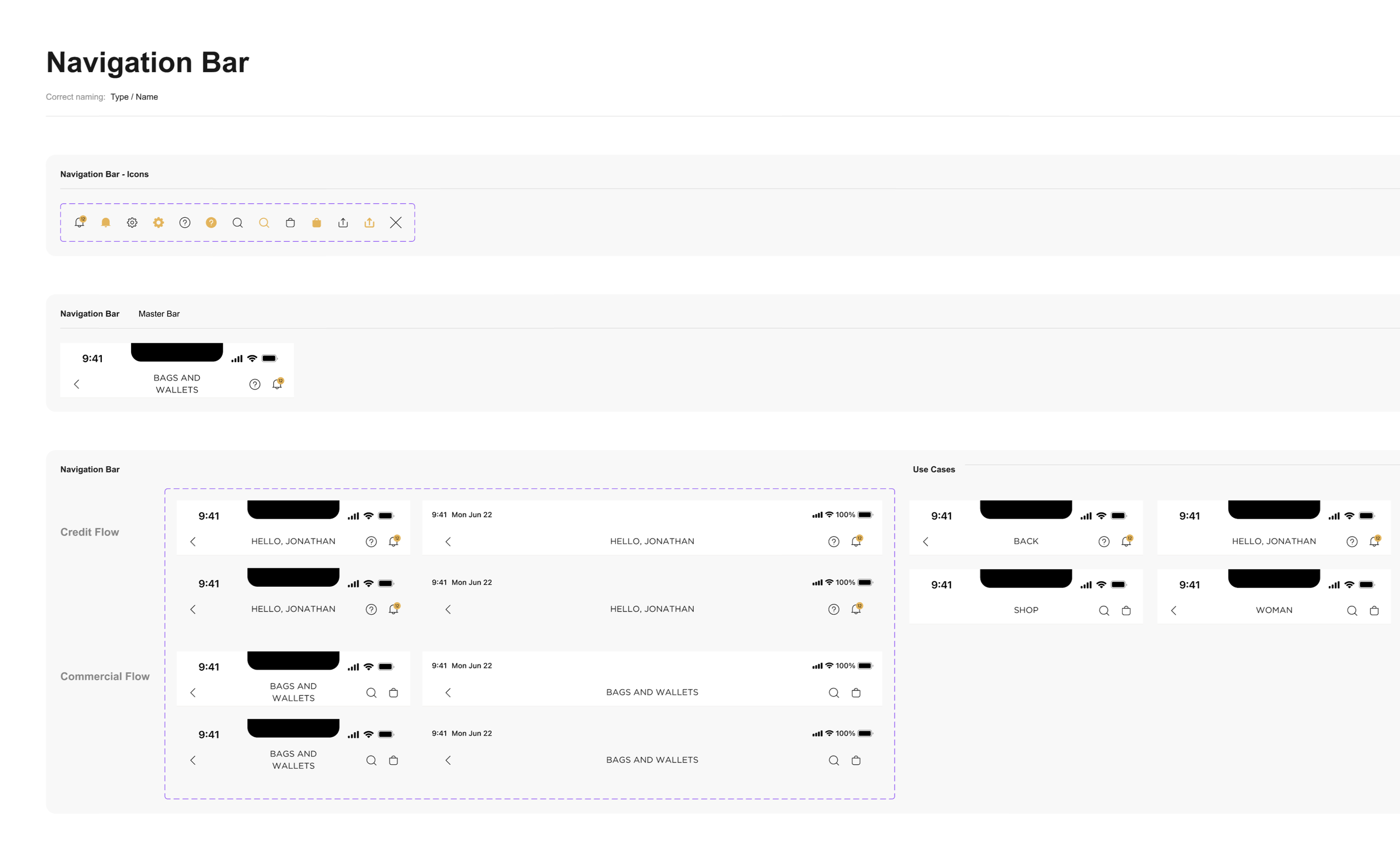
Design System
To ensure consistency across the entire e-commerce experience, we collaborated on a scalable design system tailored to Palacio de Hierro’s brand. I worked on defining and documenting reusable components that aligned with the visual language and business goals.
This system helped streamline the design process, improved handoff with development, and laid the groundwork for future scalability across desktop and mobile platforms.